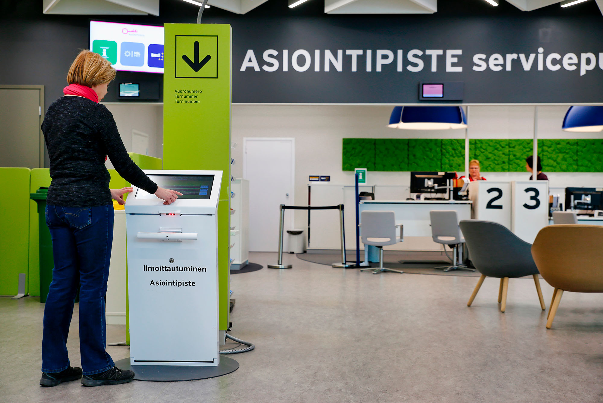
Mentally, a patient's path begins already at home, when they receive an appointment reminder or an invitation letter from their healthcare provider. Physically, it starts when the patient arrives at the health center or at the hospital. The first thing that the patient usually encounters is a self check-in kiosk. Developing, delivering, and especially programming of such devices is routine work for us at Axel Health, so I decided to write a short blog post on the key ingredients of designing and implementing a great user experience for a self-service kiosk.
1. Human perspective
First of all, the self check-in kiosk, its software and user interface should emulate, as accurately as possible, the tasks that were earlier taken care of by real people. The device should be friendly, polite, and most of all helpful, but also assertive and provide gentle guidance. A great self check-in device is like a nurse that takes the patient by the hand and always guides the patient to the right place.
2. User-friendliness
We're dealing with a machine, so the device must be easy to use. Because of this, our product development's main goal is that the patient – a person who has some kind of health issues and has sought help from a healthcare provider – is in the best possible virtual hands. People with health problems tend to focus very strongly on their well-being, getting a diagnosis, and getting treatment, so they're in a very different mental state than when they're healthy. This is why the user interface of our self check-in kiosk is visually very simple and intuitive and it uses clear language. In addition, our user interface meets most of the web content accessibility requirements, which address, for example, the needs of the visually impaired. No matter what day or time it is, the self check-in kiosk gladly and tirelessly greets and guides patients. And the kiosk won't get tired of meeting even hundreds of patients per day.
We have polished and improved the software of the device to ensure its usability, but we haven't forgotten the devices themselves. Over the years, we have learned a great deal about this topic as well. Over ten years ago, our first kiosk models were cumbersome to install, maintain, repair, and – to some extent – to use. In addition, we only offered wall-mountable self check-in kiosks. However, the same basic functions – check-in with a health insurance card (Kela card), driver's license, invitation letter, or by entering a personal identifier using a virtual keyboard – existed already then. The implementation just wasn't as mature as nowadays. Today, things are much better for devices as well. We have both wall-mounted and floor-mounted devices and people with special needs have been taken into consideration in their design. Finnish top designers with references like Kone elevators, Tunturi bicycles, and iLoq locks have contributed to the design of Axel Health's self check-in kiosks.
3. Taking special groups into account
Nowadays, the needs of special groups have been taken into consideration extensively. Touch screen monitors are large and they offer excellent luminosity and there's hardly any light leak. For the touch screen monitors of floor models, the vertical distance from the ground is optimized for patients of all sizes and for patients with a wheelchair. In case of wall models, the customer can decide the touch screen monitor's vertical distance from the ground. There is also an electric height-adjustable floor model, but we recommend a model with a fixed leg that is optimal for both patients with a wheelchair and for patients of different heights.
For example, at children's clinics and hospitals, wall models are usually mounted lower than usual to make sure that little patients' visits are as smooth as possible. In addition, virtual characters (avatars) can be taken into use in self check-in kiosks. Avatars guide pediatric patients throughout their visit. In addition, our self check-in kiosks are often equipped with wristband printers that allow the little patient to print out a wristband featuring the avatar they have chosen.
4. Hygiene and information security
Our self check-in devices can also be set up for completely touchless use. Devices delivered by Axel Health are designed for healthcare use and they can be cleaned with cleaning agents and cleaning tools that are commonly used in healthcare facilities.
Touch screen monitors are equipped with privacy filters and the monitor of a floor model is at a 45 degree angle. This protects the patient's data from bystanders and prying eyes and ensures secure check-in.
5. Versatility
Axel devices can also be used for making payments, such as outpatient clinic fees, right before or right after the visit. In addition to a barcode reader and a patient wristband printer, our self check-in kiosks can be equipped with a payment terminal. The fee can be paid with a debit or credit card.
6. Easy maintenance
Our self check-in devices come with a fixed casing and the casing is equipped with a lock. This means that improper persons can't easily open the devices or cause damage to them. The wall model opens to the side, which makes replacing the receipt paper roll easy. The floor model opens to the front like a dishwasher. Replacing the receipt paper roll is just as simple as for the wall model. In addition, the floor model is equipped with a handrail for support or for storing crutches conveniently while checking in. Our devices can be used without touching the screen or with only one hand, which improves accessibility. To function properly, our devices need a normal electrical installation and Ethernet connection (RJ45). For the best possible user experience, we recommend a minimum of CAT5E connection.
A reliable, versatile, and easy-to-use self check-in device is an important piece in the puzzle when your goal is to offer an outstanding patient experience, develop efficient patient flows, and ensure accessibility and information security. We'd be glad to share more insights with you on how Axel self-service devices can help your organization achieve these goals.


.png)


